Perfect Fit App
ui/ux design
OVERVIEW
Perfect Fit is a fitness shopping app dedicated to informing its customers about its products and ensuring they find their perfect fit in clothing.
SOLUTION
Perfect Fit's unique approach empowers users to not only shop but also contribute to a supportive community. By allowing users to post pictures and tag their clothing items, the app fosters a collaborative environment where individuals with similar measurements can find inspiration and confidence in their clothing purchases.
-
Phase 1 - User Interviews & Personas
Phase 2 - Competitor User Flow Map
-
Phase 1 - Map
Phase 2 - Lowfidelity wireframing
-
Phase 1 - Adding Improvements
-
Phase 1 - Ideation & design
-
Phase 1 - User Feedback
Phase 2 - Final Prototype
*Categorized into 5 key projects with multiple sub-phases, this drop-down menu offers an overview of the upcoming design process
PROJECT 1 - PHASE 1: User Interviews & Personas
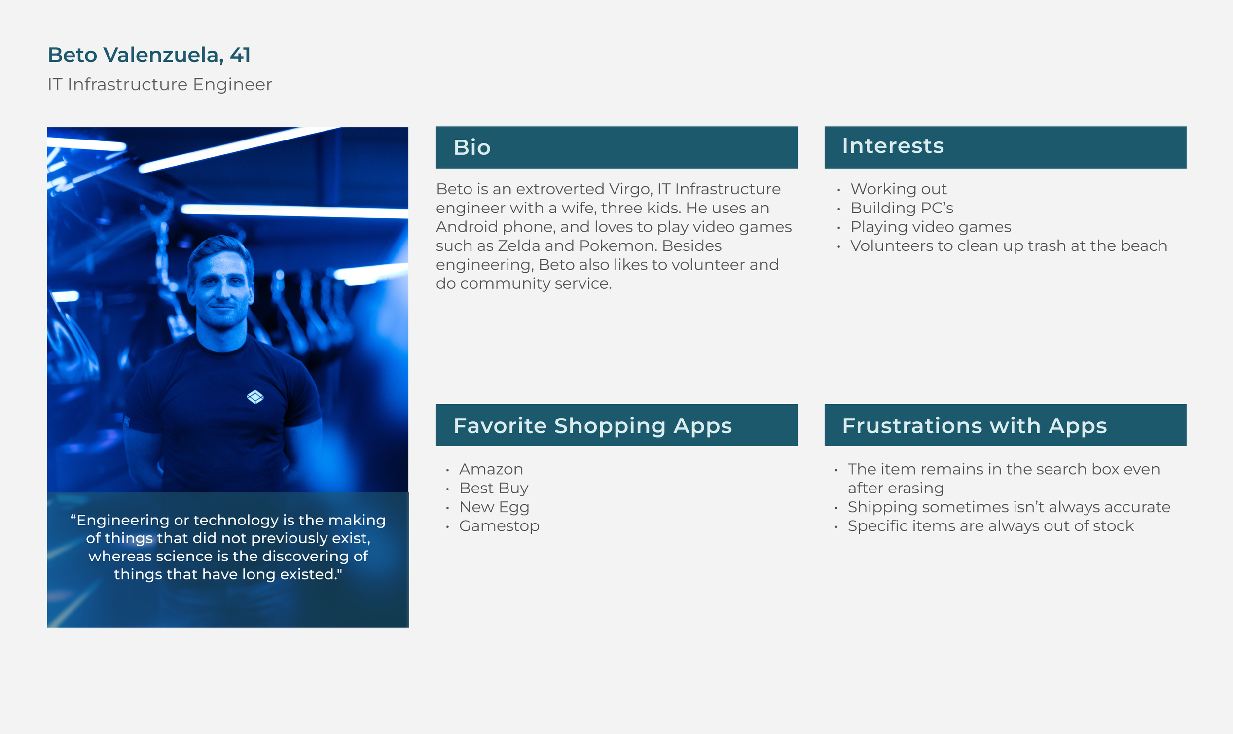
After deciding we wanted to complete a prototype for a shopping app, my partner and I conducted research to understand users pain-points towards their favorite shopping apps, and then created our user personas.
PROJECT 1 - PHASE 2: COMPETITOR USER FLOW MAP
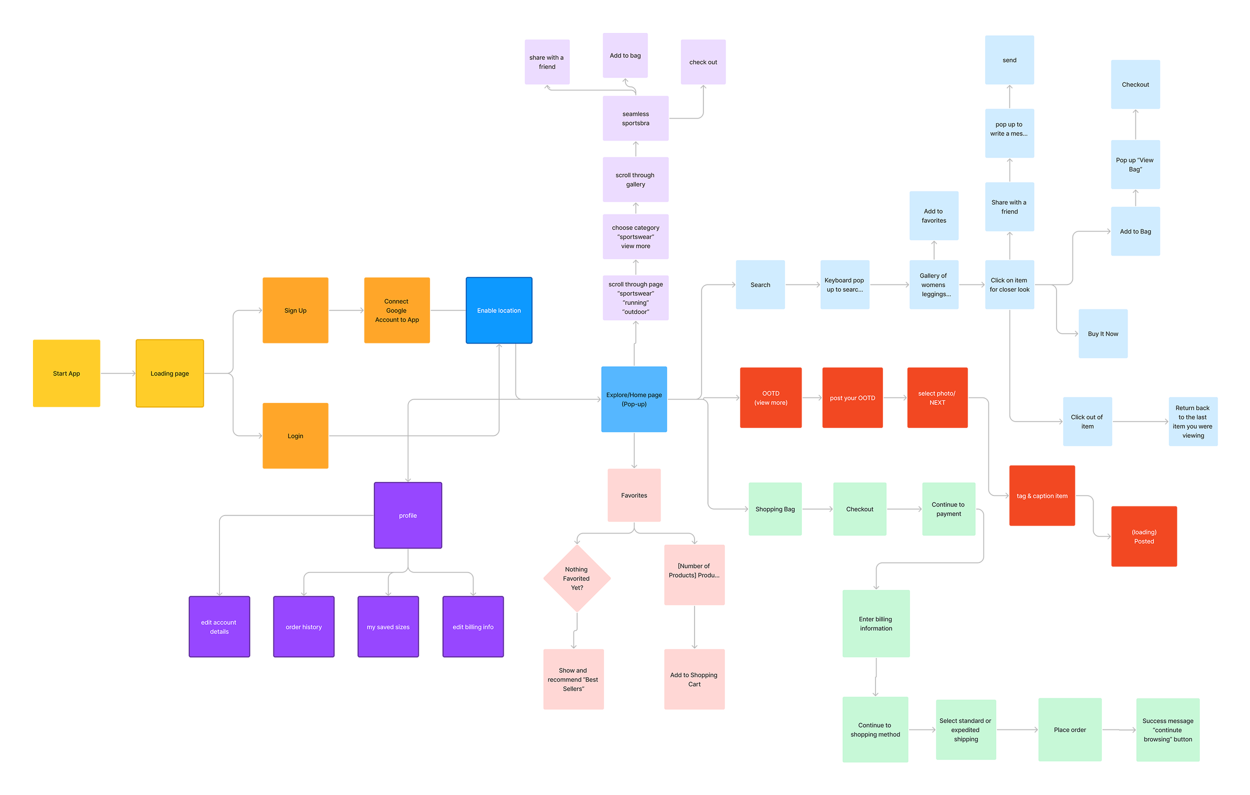
We completed competitor research by mapping out the user flows for the Adidas shopping app.
PROJECT 2 - PHASE 1: PERFECT FIT MAP
We knew that our users had a few things in common:
they wanted a more personal experience
they wanted more information about the product
they wanted an easy checkout process
PROJECT 2 - PHASE 2: WIREFRAMING
We opted for a simple minimalistic layout and a clear sense of hierarchy because we wanted the focus to be on the items up for purchase.
PROJECT 3 - IMPLEMENTING IMPROVEMENTS
After creating our low-fidelity wireframes we interviewed our four users for additional feedback. Some of the improvements we made based on the feedback included:
switching the on/off toggles in the checkout process to radio buttons
placing an invisible square around each chevron to ensure ease of pressing the buttons with their thumb
added a loading page to the area where a user can upload an “outfit of the day” so that there was an indication that an upload was in progress
also added a confirmation page to indicate that an outfit of the day had been posted.
PROJECT 4 - IDEATION & DESIGN
My teammate designed the logo with the idea in mind that our unique flow included the ability to share your measurements with your OOTD, allowing users to get their Perfect Fit. We chose Monserrat as our typeface for it’s readability, versatility, and warmth. We chose to utilize a rich dark blue with a peach accent color to ensure that the app had a friendly feel but also felt unisex despite having mainly women’s clothing.
PROJECT 5 - FINAL PROTOTYPE & USER FEEDBACK
“Clean, easy presentation, able to log in quite easily. Allows me to easily choose different categories.” - Elena Buenrostro, 35
“I like the colors, definitely seems like a unisex brand even if there’s a lot of women’s clothing being marketed.” - Inakie Jaime, 30
“I think the app works very well. It has a comfortable design to navigate in, and it doesn’t feel overstimulating.” - Diana Valenzuela, 30
“The option to see the product in different colors worked best as well as having all the purchased details of the receipt.” -Maria Marino, 25


