
MusicLink Foundation
brand/identity design
logo design
web/mobile design
ui/ux design
OVERVIEW
For this concept project, I was tasked to create a new brand identity for MusicLink Foundation that would resonate with their mission of providing music education opportunities to underserved communities.
SOLUTION
The resulting visual identity sets the foundation for a strong and memorable brand presence, reinforcing the foundation's commitment to music education and community enrichment.
MOODBOARD


SKETCHES

TARGET AUDIENCE

The Supportive Parent or Guardian: Donda
Demographics: Age 30-50, parent or guardian of children interested in music, from low-income households.
Characteristics: Committed to their child’s development, aware of the importance of music education. However, financial constraints make it challenging to provide formal music lessons.
Needs: Affordable and reliable music education opportunities for their children, a trustworthy platform connecting them with qualified music teachers.

The Aspiring Young Musician: Katie
Demographics: Age 8-15, from a low-income family.
Characteristics: Passionate about music, may have shown talent or interest but lacks resources for formal training. Comes from a diverse background, eager to pursue their musical potential.
Needs: Affordable access to quality music lessons, guidance, and mentorship from professional music teachers.

The Philanthropic Music Teacher: Mark
Demographics: Age 25-60, professional music teachers with a passion for community service.
Characteristics: Experienced in teaching music, financially stable, and eager to contribute to their community. They believe in the transformative power of music education and want to make a positive impact.
Needs: Opportunities to give back to the community through their expertise, a platform to connect with students in need, and a sense of fulfillment from supporting the next generation of musicians.
THE LOGO
The chosen logo concept features interlocking musical notes forming a dynamic and cohesive shape. The clean and geometric lines of the logo give it a contemporary feel, while its simplicity ensures versatility across various applications.


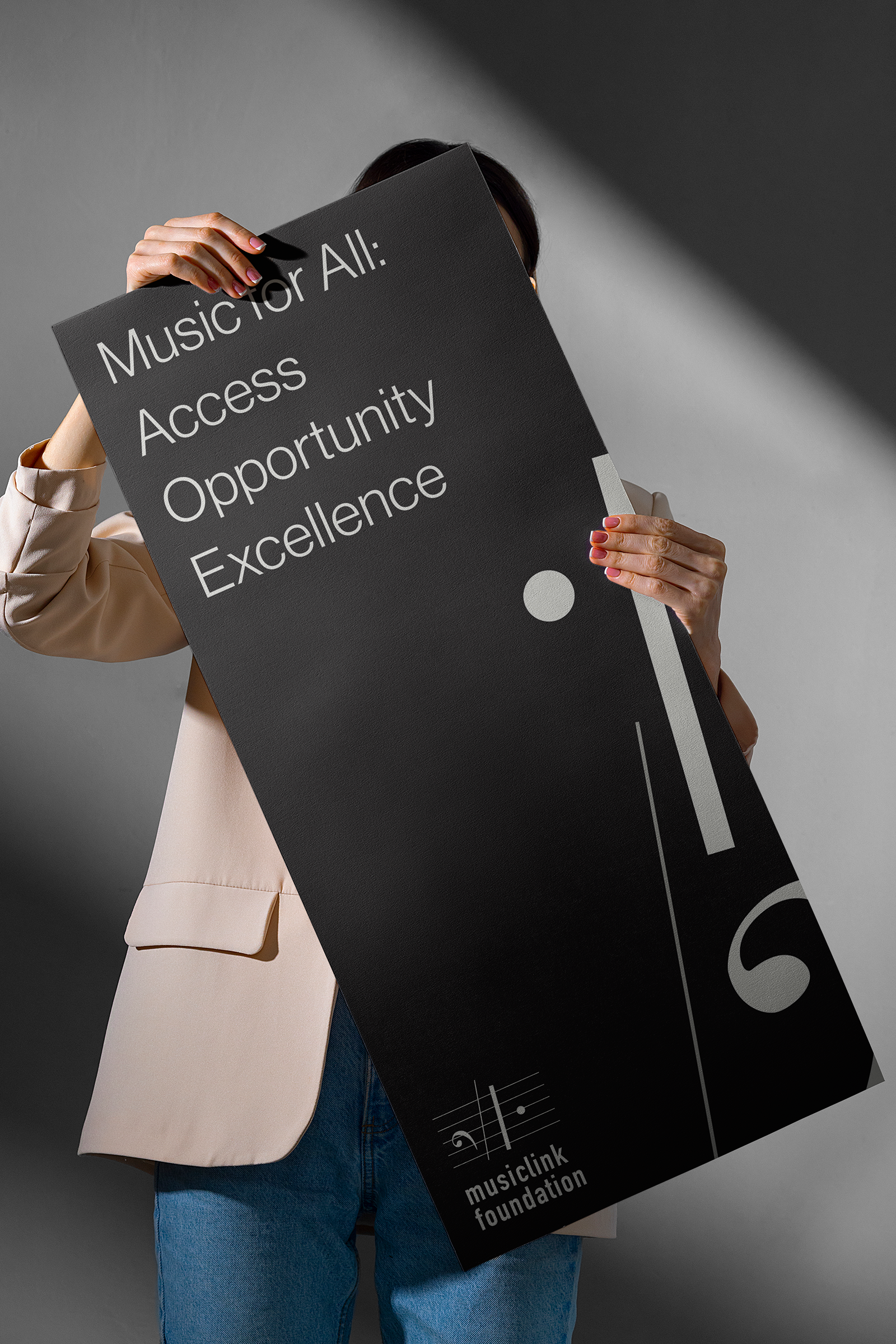
A CONTEMPORARY PALETTE
I opted for a black and white color palette, symbolizing the universal language of music. This minimalist approach not only conveys sophistication and professionalism but also ensures the brand remains timeless and adaptable to different contexts.
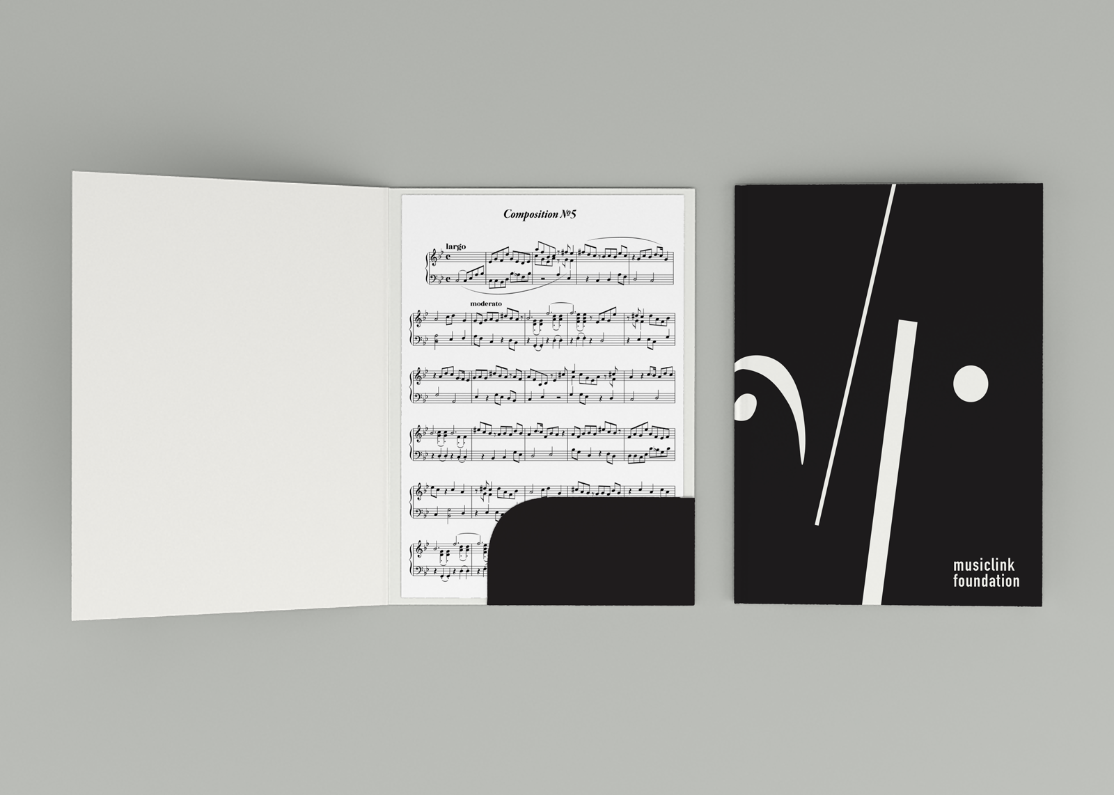


TYPOGRAPHY
I chose DIN Condensed and Neue Haas Grotesk as the typography because of its timeless elegance and versatility. The combination of DIN Condensed and Neue Haas Grotesk creates a harmonious typographic system that balances contemporary aesthetics with classic sophistication, ensuring clear communication and visual impact across all brand touchpoints.

LANDING PAGE - DESKTOP & MOBILE
I made sure that within the landing page, each section is catered to each one of the three personas that represent MusicLink’s target audience: the parent, the student, and the volunteer music teacher.

