Dolores Chocolates
brand/packaging design
OVERVIEW
Dolores Chocolates is a concept brand inspired by the idea of two chocolatier sisters who took influence from their grandmother Dolores’ dessert recipes. Their brand is targeted toward other chocolatiers, travelers, and romantics, in other words, those who enjoy savoring the moment.
SOLUTION
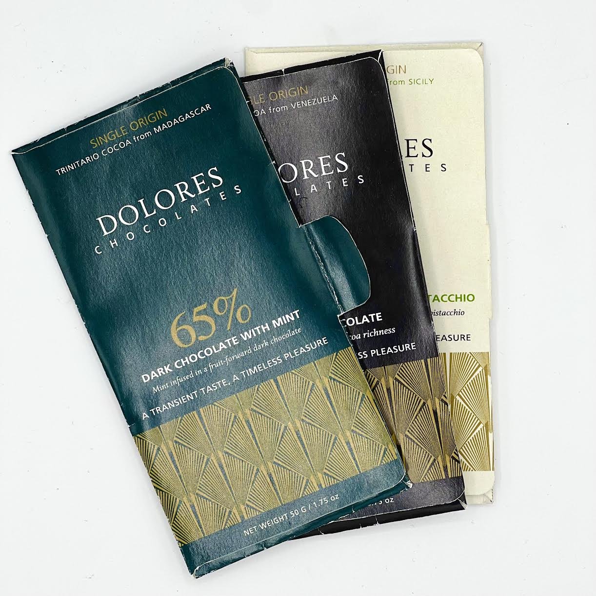
The packaging features a pocket design to conveniently store leftover chocolate for later use. Inside, it contains a map pinpointing the precise origin of the cacao beans, along with a tasting wheel. There is also space provided for note-taking, accompanied by an explanation of the tasting wheel and cacao beans, as well as a recommended spirit pairing.
MOODBOARD


SKETCHES


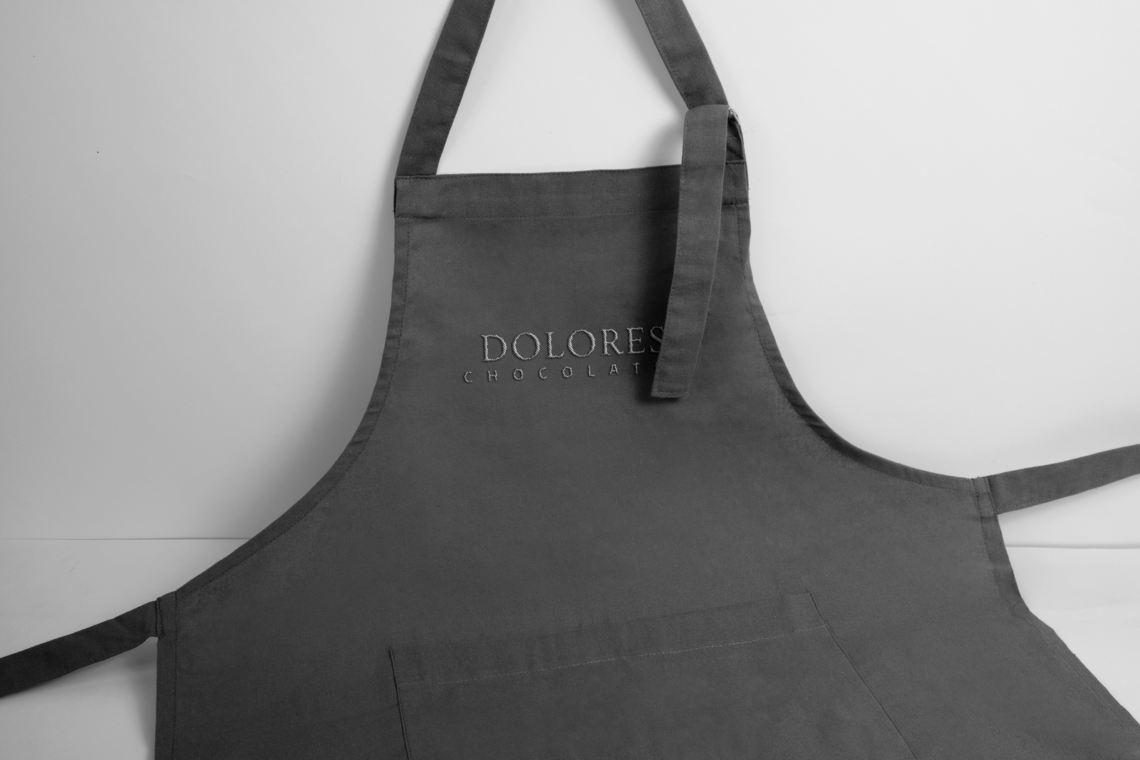
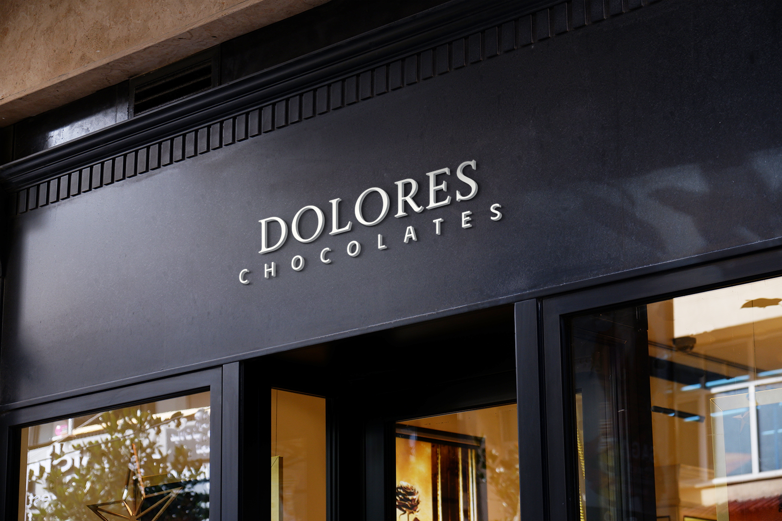
THE LOGO
The logotype for Dolores Chocolates, crafted in Priori Serif Regular, exudes refinement and tradition. Against a palette of ivory, teal, and black, and complimented by the gold pattern, the logo radiates luxury and sophistication.
THE PACKAGING
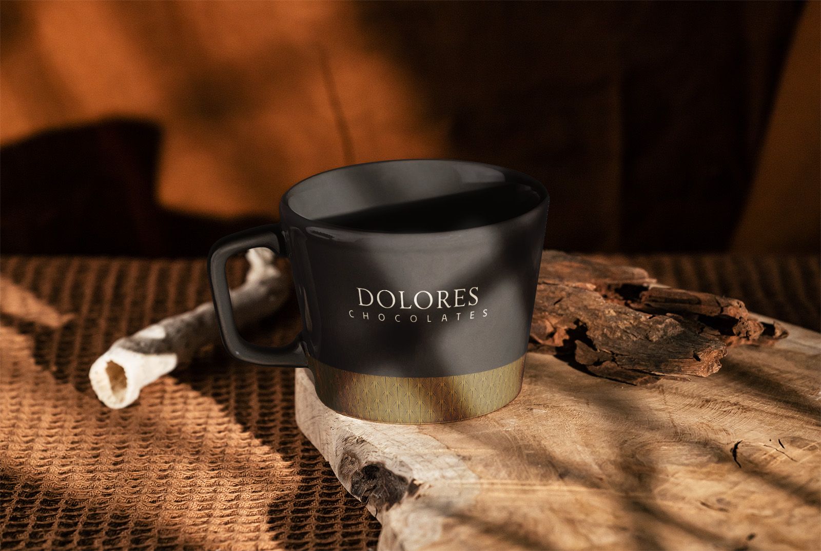
The packaging for Dolores Chocolates features a pocket-like design, perfect for storing leftover chocolate. The exterior prominently displays the chocolate percentage and the origin of the cocoa beans. The brand's pattern is meant to be laid in gold foil to underscore the luxury of the brand.
THE TYPOGRAPHY
Prominently featured on the front, the chocolate percentage is in STIX General. The mission statement is elegantly displayed in Priori Serif Regular, which communicates the brand's ethos, while Frutiger lends clarity to all other body copy.